
JCamp Marketing Campaign
Collaborating closely with camp stakeholders, I led a comprehensive marketing campaign to boost JCamp’s visibility and attendance. From initial theme ideation to final advertisement production, this project blended strategic market knowledge with cohesive visual design.

Step 1
Pick a Theme
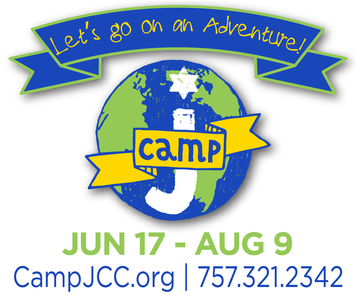
During the planning phase, we had no shortage of ideas. To keep the messaging focused yet inclusive of all the camp’s offerings, we decided to select a unique theme for each week under one umbrella slogan. We wanted something inviting and adventurous for children, leading us to our winning concept: "Let’s go on an Adventure!"
Step 2
Adapt the Brand
Working with an established brand required a delicate balance of innovation and consistency. To incorporate the "Adventure" theme without obscuring the original JCamp logo, I designed a custom banner header. I utilized the existing brand colors in alternative positions to create a fresh look that still felt familiar, paired with a playful, kid-friendly font to match the camp's energy.


Step 3
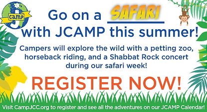
Create Ads (Print)
As the theme of each camp week was going to be different, I wanted to create an ad that could be adjusted for the differing themes as needed. My solution was to create a fill-in-the-blank tagline that allowed the assets to be easily modified for various themes while maintaining a consistent layout. Each ad included the tagline, an artistic word version of the theme, a breakdown of that week's events, and border art to match. I also created a postcard to mail to UJFT members and previous camp attendees featuring photos of previous camp events. Both were placed in event booklets, newsletters, and posted on the UJFT website.
Step 4
Create Ads (Digital)
When planning the marketing campaign for JCamp the stakeholders knew they wanted to have digital ads, but were not sure where they should be. Based on my research findings, we targeted MyActiveChild.com and Facebook (specifically targeting mothers aged 24–45 in the local area). I designed simple animated GIFs to catch the eye without overwhelming the viewer. By splitting the content with one frame focusing on logistics (who, what, where) and the second on activity highlights, we successfully boosted visibility and engagement. This ultimately led to a 25% increase in camp participation.

Step 5
Create the Calendar
With sign-ups rolling in, the final challenge was creating a functional, high-energy summer calendar. The goal was to fit a massive amount of information onto an 11x17 inch sheet without sacrificing readability.
The Solution: I developed a color-coded key to help parents distinguish between weeks at a glance. I used muted tones for the background to keep the text legible while incorporating fun graphics for daily activities. The feedback was immediate — parents reported that the calendar helped get their children excited for the summer ahead.